Walk past the cafés, boutique shops and newly refurbished Grand Hotel and you’ll come to the gold mine on the corner of Colmore Row and Newhall Street – No.: 85-89 Colmore Row to be precise. There you will find the newly named and branded ‘Colley Ison Gallery’, formerly ‘Reuben Colley Fine Art’.
Typically, when I’m in Birmingham I pop in to have a chat with Tim Ison the gallery director and chat about what the latest craze in the art world is and enthral at what’s hanging on his walls at the time. This is a special gallery
– a place of calm, quiet time, a place to reflect, a place to enthuse and marvel at what artists have created and how they can stir the weirdest and most wonderful emotions in us. And if you wish to learn a little more about a particular piece’s provenance and investment potential, then Tim and team
are always on hand.
Over the years Tim and I have got to know each other a little better and he’s become an art confidant of mine. So much so that in the Summer of 2020 when the coronavirus pandemic hit the world, Professor Paul Cadman and a small handful of like-minded philanthropists set up art4charity. ‘Forward in Unity’
– Birmingham’s version of the nurse in scrubs giving ‘the finger’ to the coronavirus – was created and painted in ten days by world renowned, Birmingham born and bred graffiti artist – Gent48. The art4charity team then set to work on monetising this great masterpiece, situated behind Norton’s Bar on Meriden Street in Digbeth, with all proceeds to be shared between four of the city’s most relevant charities. Tim very kindly gave of his time and expertise on how to create fine art prints, sell them and curate the range of artefacts that we have on our website: www.art4charity.co.uk Thank you Tim!
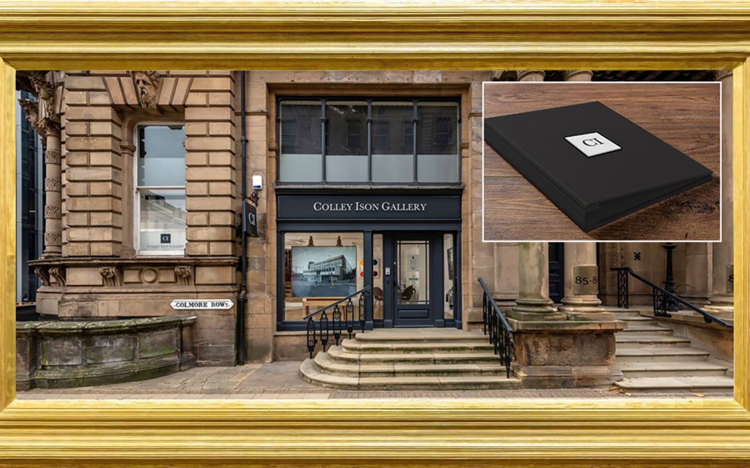
On one of my visits to see Tim, he challenged me on the intricacies of changing his brand’s name from ‘Reuben Colley Fine Art’ to ‘Colley Ison Gallery’.
The brief was straight forward – change the initials and name on the iconic gallery’s signage and stationery, use the existing font, ‘Baskerville’
(designed in the 1750’s by John Baskerville in Birmingham) and reflect the gun metal grey and lighter grey colour used on the gallery’s outer façade
and pavement sign. A few story boards and meetings later, the contemporary look, artwork for the logo and print work was signed off and duly implemented. Items of note being the super thick, durable business cards and range of pocket wallets and document folders – all protected with anti-scuff laminate to retain their pristine look – for interested parties to take away relevant information and ponder at their leisure.
The jewel in the crown, however, was the instruction to create a colour matched charcoal grey buckram folder, inset with a chobi (light grey) plaque, black foil blocked with the initials ‘CI’. The purpose of this folder, which is stocked with twenty clear sleeves, is to display a tangible record of digitally created copies and pertinent information about the collector’s art pieces, purchased from the gallery. The folder is presented in a similarly beautiful and exquisitely
hand-crafted clamshell box, which would naturally invite inspection.
A wonderful ‘thank you’ present.
This festive season be sure to pop in and meet Tim in the newly branded Colley Ison Gallery on Colmore Row and indulge yourself in their eclectic mix of local and world-renowned artists. www.colleyisongallery.com
There are golden nuggets in every brand and what’s certain is that they are worth uncovering and publicising to your audience.
Does your brand need to sparkle again, look slightly more contemporary whilst retaining its historic values or completely change? If the answer to any of these is ‘yes’, then drop me a line and we can discuss your thoughts.
Nick
Brandologist
Moo Design
T: 01926 770042
E: nick@moodesignagency.co.uk
At the end of Colmore Row in Birmingham there’s a gold mine